
Composting Educational Mobile Application
Overview
The MyComposter mobile application was for the graduate level class of User Centered Design (HCDE 518) at the University of WA during fall semester 2021. The goal of the project was to apply the entire user centered design process. Each week we assessed the best way to divide the work, so each team member, including myself, took on multiple roles. Throughout the project, I participated in research, design, prototyping, etc.
The design question we started with was “How can we make it easier for households to compost?” After beginning research, we discovered that there were already products that make it easier to compost, but we found that there were different levels people were contributing to the composting process, from recycling food to full on composting. Even though they were still contributing in some way, we learned their frustrations of composting included a lack of educational resources on what can and cannot be composted, pests, physically challenging, and more. Therefore, we refined our design question to be “How can we make it easier for households to participate in the composting process?”
MyComposter is an educational mobile app that will make it easier for households to compost or recycle organic waste.
Disclaimer: This case study is a refinement of a case study my team created at the end of the project. I refined it to fit my portfolio.
Design Process
User Centered Design Process - Reference: University of WA HCDE 518
-
RESEARCH METHODS
Literature Review
Interviews
Survey
Personas
-
IDEATE METHODS
Sketching
Affinity Maps
Four-quadrant matrix
Storyboards and Use Cases
User Flow Diagram
-
PROTOTYPE METHODS
Figma Low-Fidelity Prototype
Figma High-Fidelity Prototype
-
EVALUATION METHODS
Test Plan
Defining the Problem
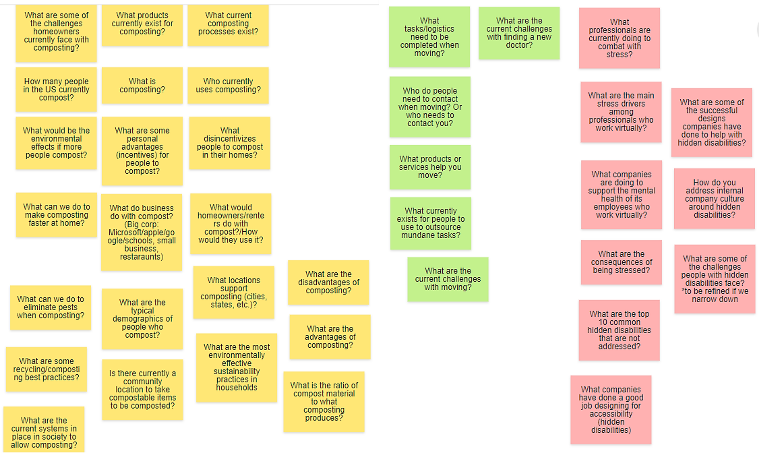
To determine the problem we wanted to solve, we needed to select a design question. Using Klaxoon, we hosted an affinity mapping brainstorming session where we each came up with potential design questions based on four areas of interest: sustainability, moving, career, and well-being. We used Klaxoon to vote for our top three design questions.
The top three included 1) “How can we make it easier for households to compost?”, 2) “How can we make it easier to update your address/contact information with a move?”, and 3)”How can we help companies recognize hidden disability more?”. As a group, we created research questions and target audience for each design question and decided to move forward with “How can we make it easier for households to compost?” as our initial design question. The research methods we selected based on our questions were literature review, interviews, and a survey.
-
Design Questions

-
Research Questions
-
Target Audience

Problem Statement
“How can we make it easier for households to compost?”
Research
My team’s experience with composting consisted of non-composters to novice, so we felt a literature review should be our first research approach. The literature review helped us dive deep into existing research and resources to better understand how people are currently composting. We used these findings to start building our hypotheses around people’s motivations and challenges with composting which helped frame our interview discussion guide to gather qualitative insights into people’s motivations and barriers to composting. During the interviews we quickly discovered that there are two distinct methods for composting: people who collect organic waste for city pick up (we call them “food scrapper”) and people who turn organic waste inter fertilizer at home (“composter”). This new learning shifted our survey approach, instead of just targeting people who compost at home we built the survey with appropriate branching so that we could understand if the different methods for composting impact the user’s motivations and challenges.
-
LITERATURE REVIEW
33 references from research reports, articles, and discussion forums
Research Questions
What is compost? What are composting best practices?
How do people compost today?
How can we eliminate pests when composting?
-
INTERVIEWS
10 interviews with current composter and people who previously composted but stopped
Research Questions
How do people compost today?
What are motivations for composting?
What are challenges with composting?
What are some best practices?
-
SURVEY
150 respondents including composters, former composters, and food scrapers
Research Questions
Are there different motivations for people who compost vs food scrap?
Are there different challenges for people who compost vs food scrap?
What would make it easier for people to contribute to the composting process?
Key Research Insights
-
Painpoints
Bad odor, pests, time commitment, and conflicting composting information
-
Motivations
Reducing waste, producing organic fertilizer, and helping the earth
-
Current Products
There are already a plethora of physical products to address odor, pests, and time commitment issues
-
Conflicting Information
There isn’t an easy way to find location-based information to help with composting
The design question we started with was “How can we make it easier for households to compost?” After literature review research, we discovered that there were already products that make it easier to compost, but found that there were different levels people were contributing to the composting process, from recycling food to full on composting. Even though people were still contributing in some way, we learned they still had frustration dealing with composting including a lack of educational resources on what can and cannot be composted, pests, physically challenging, and more. Therefore, we refined our design question to be “How can we make it easier for households to participate in the composting process?”
“How can we make it easier for households to participate in the composting process?”
Understanding the Users
It all begins with an idea. Maybe you want to launch a business. Maybe you want to turn a hobby into something more. Or maybe you have a creative project to share with the world. Whatever it is, the way you tell your story online can make all the difference.
The affinity mapping led us to create three different personas whose main motivations include: reduce organic wastes, produce organic fertilizer, and help the earth. We found that each of these personas have different motivations, challenges, and composting habits. Note that these personas are not necessarily related to their composting method (at home composter or food scrapper). The composting method is primarily determined by household type and availability for city pick-up. This was most evident with the environmentalists who we discovered are both composters and food scrappers but really see composting as part of their identity. We then used these personas to start ideating and sketching potential design solutions.


Ideation
We each sketched a variety of product ideas that ranged from physical to digital. Collectively we had almost 30 ideas that needed to be narrowed down so we used a four-quadrant matrix to understand each idea’s value vs. level of effort to implement. Then, we used an affinity map to look further at narrowing down the ideas that fell in highest value and easiest to implement segment.
Sketches
Focusing on the persona’s frustrations, each team member created ideation sketches. Sketching helped us think creatively and communicate our ideas to each other more effectively.
Jyssica Baehr (Me)
Trash sorter.
Food scrap blender/chopper.
Lid specifying compostable foods.
Mobile app to find people in the community needing compost material.
Educational mobile app.
Die fly and die fly 2 pest control.
Compost bin monitoring progress.
Remote controlled compost turner/mixer.
Compost bag roller.
Team Member 1
An app that connects you to the communities/resources that helps reduce waste.
Smart hanging compost bin.
An app that recommends resources/tools for reducing organic waste.
An app that could be integrated or partnered with next door to crowdsource organic waste.
An app that matches the new composters with seasoned composters in a similar location.
An app that connects chicken owners with food scrap collectors.
Team Member 2
The compost game.
Phone app compost camera.
Under the sink removeable compost bin.
Educational app.
Compost info cards.
Ergo rake for turning compost.
Team Member 3
App that works with at home composters.
API that works with Alexa.
Airtight seal.
Educational app.
App that lets you track your outdoor compost.
In-counter recycle, track, and composter bins.
Four-Quadrant Matrix
The four-quadrant matrix helped us look at each idea’s value and level of effort. Using the chart made it easier to narrow down which ideas were most beneficial to the user and which ideas could be completed with our time limit.
As a team, we determined which ideas from our individual sketches had the highest value and were the easiest to implement.
Affinity Diagram and Voting
An affinity diagram is used to group ideas and explore common themes. We used the diagram to determine which of our ideas were similar and what was similar about them.
Using affinity maps, we grouped the individual sketches into categories. We used Figma stamps to vote on our top individual top 3 and selected the final 3 ideas based on maximum votes. The value vs. effort chart contributed to which ideas we voted on.
Top Three Ideas
The final three ideas ended up being of higher value and medium level of implementation according to four-quadrant matrix. The final categories we voted on were an educational mobile app, a mobile app game, and a compositing community mobile app. We all leaned towards a mobile app solution since there was no lack of physical products that help with composting, but rather a lack of awareness and information. The affinity map showed us that the sketches were similar ideas, but slightly different features. We combined the different features from the individual sketches to create a single sketch for the final three ideas.
Educational Composting Mobile App
“Community Connections” Digital Community
Educational Composting Mobile App Game
Design Solution
The team discussed and voted on the three sketches and Idea 1: Educational composting mobile app was the winning solution. This app will provide educational information to help people contribute to the composting process, either via composting at home or recycling organic waste through a city pickup program. We felt a comprehensive one-stop shop of resources would be the most valuable solution as it was a common complaint across all three personas in our interviews and survey. The next step in our process would be to understand various scenarios for using the app.
Storyboards
After coming to a design solution of creating a mobile app, we needed to understand and think of scenarios of how a user would discover and utilize our design solution. Storyboards help clearly convey how the story of a use case will flow. After creating scenarios accompanied by storyboards, we can move to the next step of creating our design goals and a user flow of the mobile app.
Use Case 1
Jyssica Baehr (Me)
“As a user, I can reduce the amount of food waste by through food scrapping.”
An environmentalist new to food scrapping determined that food scrapping is the best way for them to help reduce food waste. They need to figure out what can be composted. After finding the app, they discovered it had an image recognition feature that allows them to take a photo of a food and tells them if it can be composted.
Use Case 2
Team Member 1
“I am food scrapper who is not sure if some food scraps are compostable or not in my area”
A resident in King County was cleaning the kitchen after the meal and went through the food scraps to decide which are compostable and which are not. She was not sure if fish bones are considered compostable in her county. She then opened the compost recognition app (she had already created an user profile and entered her zip code information). After she scanned the fish bone, the app asked her to confirm that it’s indeed a fish bone. She then confirmed that it’s a fish bone. The app popped up a message saying that the item is considered compostable in King County.


Use Case 3
Team Member 2
“As a user, I would like to reduce the amount of yard waste by dropping off the waste at a local composting facility.”
Long-time home gardener just moved to a new suburb and while setting up her new garden and compost bin she discovered she has way to much yard waste! That many greens will never compost. She finds an app that shows where she can go locally to drop off her organic waste.


Use Case 4
Team Member 3
”As a user, I would like to reduce amount of physical trash by participating in composting at home.”
A household member has more garbage than their bin can hold. They try to think of ways to reduce the amount of trash they produce. Maybe they could start by separating food waste and scraps from their trash and participate in composting. Now they are unsure what their current options of how to compost, what is compostable, where to take it and what to do with it. They look on their phone for ways to compost and how to get started and find a mobile app to that gives them information on how to get started on composting.


Design Principles
Design principles are a set of considerations that form the basis to create an effective and attractive deliverable. Before considering starting design, designers should have a set of design principles. These principles will help aid in positive constraints to allow for good design. Clearly defining design principles will help start design as well as future iterations and keeping design consistent.
Customer Experience
Design should provide user with a positive experience and feeling of accomplishment.
Minimal disruption
Solution should be easily integrated into a person’s life and lifestyle. This can be measured by how difficult it is for them to learn to use or how much it disrupts their current/natural workflow.
Learnability
Design should be easy to learn the interface, should be effortless and should follow common design patterns.
Refinement and updates
Must be able to refine and update content and features with emerging technologies and education to encourage continuous use.
Ease of use/ Usability
The design should be easy to navigate and intuitive even for a first-timer user.
Accessibility + Inclusivity
The design should accommodate the needs of a variety of users especially those with disabilities. Design should also meet WCAG standards.
User-focused
The design should help users complete their job-to-be done.
Brand Cohesion
Design must maintain consistent and cohesive branding.
Brand and Identity
One of our design principles was brand cohesion so we needed a brand identity. This is a visual representation of the values and “personality” of our brand. Identity design essentially sets the tone of your brand, and it can be used to evoke specific feelings in our audience. We wanted our brand identity to be designed to communicate our company’s overall message. We chose to use warm neutral colors that emulate earthly, organic materials. We also chose simile icons and buttons to ensure our product follows the ease-of-use design principle.
First User Flow
After creating use cases with respective storyboards, design goals, and brand identity we needed to create a user flow. Our team each created different user flows. We then combined our work to create a high-level flow of the entire app. We then assigned each team member a different flow to create the wireframes for their assigned scenario.
Low-Fidelity Prototype
After completing the user flow, each team member created several wireframes. Wireframes allowed us to quickly design potential layouts and get feedback from our fellow team members. We intentionally prioritized the user experience of the app (instead of investing time and effort in pretty visuals first). Thus, we were able to quickly iterate and improve the design. Lastly, we wrote our script to test our interactive prototype with people outside our group.
User Testing
We tested our mid-fidelity wireframes with two HCDE students to find usability issues with our three key features (check item, learn, map). We wanted to know if users can perform the tasks successfully and whether the design is intuitive and easy to navigate. We also wanted to understand how certain features are perceived by users.
Task 1
Assume you are sorting through your organic waste and are not sure about the composability of certain item(s). Go where you can find if a certain item is compostable or not. Please talk out loud as you go through each step and when applicable, give out the reason why.
Task 2
Assume you just moved into a new neighborhood and are interested in setting up a compost bin in your backyard. Where would you expect to go to find information about how to get started? Please talk out loud as you go through each step and when applicable, give out the reason why.
Task 3
Assume you just moved into a house with a yard. The yard requires some cleanup, so you have multiple bags of leaves, twigs, and grass that you need to dispose of. You downloaded MyComposter app to help you find where to dispose the yard waste.
User Test Results
After the evaluation we outlined the problem areas sorted by severity. Issues were derived from participant statements and direct observations.
-
Home pages need bottom navigation button.
Smallest font is too small.
Quizzes not desired No added benefit and confusion of why they are there.
Calendar feature not desired.
Confusion about Recycle Food title and nobody went to the general info page for descriptions.
Alignment of home pages is different than the other pages.
Confusion about the “If you are done...” from voice recorder not clear if done or another action.
Map is a little large (takes away location text).
-
One participant (1 of 2) didn’t notice the voice recorder and camera buttons. Recommendation Consider making voice and camera icons more apparent.
Both participants (2 of 2) are casual food scrappers but don t identify as composters The learn info was confusing. Recommendation: Consider adding filter button so people can filter based on level (beginners, intermediate, advanced.
One participant (1 of 2) wanted to know what items can be dropped off at compost facility. Recommendation: Consider adding ability to list what each compost facility accepts or does not accept.
Changes to Prototype
For the next iteration, we will only focused on addressing Severity 1 findings:
Home pages: Add navigation buttons, fix top header alignment.
Check item pages: remove if you are done...” from the voice recorder.
Learn pages: Remove general info tab, change the name of Recycle Food to “City Compost.”
Learn content: Add descriptions under each page about what it is.
Map page: Decrease the size of the map.
Increase the smallest font size.
Remove quizzes and calendar.
Updated User Flow
After running 2 user tests, we received insightful feedback regarding our user flow and layout. Our participants were unsure what to do on the load screen, as well as questioned why the app needed to know their location. We also found that the participants were confused in the learn section as to what “general information” was and that it was not as useful because they would then need to read further between DIY compost and recycling food. The participants also expressed that “recycling food” was very confusing.
High-Fidelity Prototype
Final Design
The final app supports geolocation so that users can get accurate information based on the area they live in. Whether the user is a DIY composter with a bin in their back yard or they utilize the city provided compost bins, this app will help users better understand how to properly dispose their organic waste. The ‘check item’ feature allows users to quickly identify which items are compostable or not in their area by searching, taking a photo, or through voice recognition. The app also has general information and a schedule of classes to learn about composting best practices and how to get started. Finally the app has a geolocated map to find nearby waste management facilities that accept compost and yard waste.
Design Rationale
Understanding why we chose an educational mobile app and prioritized key features:
Research Findings
Through our secondary research, interviews with 10 people, and survey with 150 respondents, we found that:
The biggest challenges that people face are issues with odor/pests, time commitment, and conflicting information about composting. We found that there is already a plethora of physical products available to solve the odor and pest issues, from indoor composting products such as LOMI and Vitamix Food Cycler to outdoor composting ones such as Envirocycle. Those products are both functional and aesthetically designed. However, there isn’t a one-stop-shop place that provides best practices and recommends tools for both composters and food scrapers.
Each county has different composting guidance which explains why users experience so much confusion and conflicting information about composting.
Design decision
Since there was not a lack of physical products that help with composting, but rather a lack of a comprehensive one-stop-shop resources for people who want to reduce organic waste (both composters and food scrapers), we chose to work on a mobile app that aims to incorporate a number of features that were most requested from our interviews and surveys. This app will provide educational information to help people reduce organic waste, either via composting at home or recycling organic wastes via a local pickup program.
Design Concepts
Check Items - Focusing on the convenient aspect of the task, we decided to include the feature that helps users check whether an item is compostable or not. Since our design principles include User-focused and Accessibility and Inclusivity, we intentionally included options such as voice, image recognition, search, and image browsing so we can accommodate various users and what they define as “convenient”. Through our usability testing, we observed that users were confused with the flow of the voice and image recognition which led us to make some changes to the design so that each step of the process was clearer to the user.
Learn - Even though technically the food scrapper is not a composter, both groups are trying to reduce organic waste, which ultimately is good for our earth. Thus, we decided to include both groups (composters and food scrappers) in our target group. However, since they have different needs when it comes to educational information, we curated specific sections that are relevant for each of them. When designing for this section, we use our design principles “Learnability” and “Refinement and Updates” as the north stars to create an interface that is easy to follow and has updated content based
on the user’s location.Map - Our research data indicates that level of awareness of community compost facilities is not high. Thus, we decided to add the feature where users can find compost facilities near their home (provided they enable location sharing).
Conclusion
Creating the MyComposter application prototype was a great learning experience. If I were to continue with the project, I would re-iterated pieces of the design process, conduct more research, do more user testing with different groups of people, conduct a usability study on the app, and improve the app’s accessibility.
Meet the Team
-
Jyssica Baehr
UI/UX Designer
-
Hang Tran
Marketing Researcher
-
Kelli McGee
Project Manager
-
Nina Lascano
Designer